Testing, testing, 123…

It’s been full speed ahead with Ashwood & B. Yesterday we started experimenting with some digital transfer printing and the results are looking good so far! The wonderfully helpful people at Crafty Computer Paper spent ages talking through their paper types and advising the best option to suit our needs. We bought 2 packs, one of their yellow grid and one of the red. Printing onto the paper was very easy and the print quality was just as good as anything I’ve ever had out of my printer. Once the print was dry, I cut around the image and then using the silicone paper provided ironed the print onto a T-shirt. It was a bit of a struggle getting the whole image to bond with the fabric, but we got their eventually. I’m really pleased with the result, it looks great on the light grey marl.

image 13139153_939900036127024_330467860108252429_nNext on the test pressing was one of our colour your own T-shirts. Various different types of pens were used to see how the reacted to the transfer paper, some worked better then others and we now have a list of do’s and don’ts . Poppy (complete with snapchat filter) is doing a wear test for me today and then we’ll pop them in the washing machine to see how they get on. Fingers crossed the pens we used are as permanent as they say they are!

1936216_943121975804830_2948155537437368996_n

Memories of Summer

The rain is currently lashing against my studio window one minute and the sun is beaming through the next… I’m hoping this is a sign that winter is starting to lose the battle to spring. It seems a long way off into the distance until we will be back in the heady days of summer.

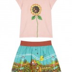
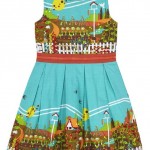
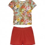
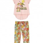
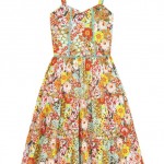
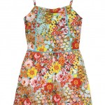
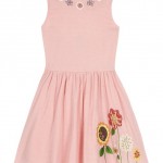
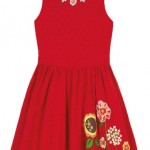
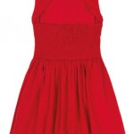
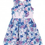
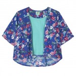
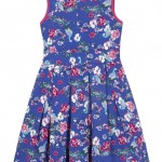
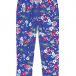
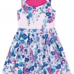
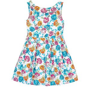
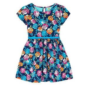
This little girls high summer story I designed for Uttam Kids was inspired by memories of growing up in the 70s, playing in my grandparents garden, summer holidays where we explored country lanes with little cottages covered in roses.

As I worked on the prints, a slight Clarice Cliff influence started to emerge, I went with it on the garden print as it felt right. But then where did the 70s get it’s inspiration from after all?


Peacocks And Parties

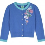
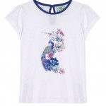
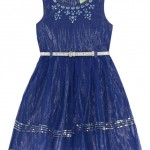
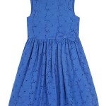
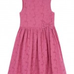
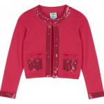
Also just arrived is my Peacock Story. Last summer after a lot of cajoling I managed to get a wonderful electric blue colour into my high summer Uttam Kids range. It looked fantastic and sold really well, so getting this blue story in this year was a breeze. Uttam Boutique always do well with an oriental inspired story every season, so it made sense to do one for girlswear. The brief for this story was for items that could be worn everyday, but also be dressed up for parties and weddings. For a change this range was not predominately cotton poplin, but a soft drapey viscous. My favourite piece in the story is probably the party dress, the photo doesn’t really do it justice, the mesh is electric blue, with a silver lurex shot lining, silver glitter belt and silver bead and sequin work.

And Keeping With The Palm Springs Theme…

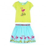
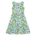
It used to be that girlswear themes were about a year behind womenswear. That has changed over recent years and trends tend to run across all areas now. (obviously there are some trends that are not appropriate for girls) As well as coming up with Palm Springs inspired prints for Uttam Boutique, I also used the trend in my Uttam Kids range. Adding in the flamingo garden ornament to the cactuses, helped make them a bit more girly and added a lovely highlight to the sun faded brights palette. The boss hated pastels, so the only way I could get them into the range was by mixing them with brighter colours.

Spring Summer 16

My Uttam Girls SS16 Collection has finally started to hit the stores, Can’t wait to pop into the House of Fraser Oxford Street store to have a look at the concession. The manager there makes such an effort to merchandise it beautifully.

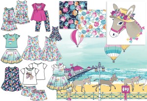
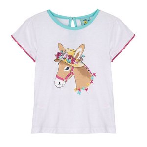
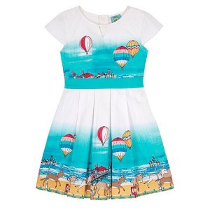
After the seaside theme worked so well last summer, it was on the cards to do another. The trend prediction services were trumpeting mermaids as being a key graphic emblem for SS16, but having done a mermaid theme not so long ago, I new I needed a different angle. I stumbled across a fantastic photo on pinterest of a little girl with a donkey and realised that was the way to take my seaside story.

I wanted it to have a watercolour feel, which I knew would be a challenge for the factories in india. There was a lot of backwards and forwards to get the effect I wanted. At red seal sample they looked great, sadly for some reason they brightened some of the print colours in production, so the subtlety was lost.

Seaside Donkey Story SS16

Here’s how the story ended up looking…

62575_UKSK0500562575_UKSK0600562575_UKSK0700562575_UKSK09027